The Psychology of Color
Crafting Emotional Experiences Through Event Design
Whether you’re maximalist or minimalist, cottage or regalcore, bohemian or extravagant, the colors you choose for your event design will not only speak volumes about you but impact the collective physiology and psychology of your guests. Using too many dominant colors without any breathing room, for instance, could evoke chaos. Forcing yourself to adhere to a scheme just because it’s trendy may make your palette look stiff and disjointed. This is why it’s essential to be original. To be yourself. The rest will follow suit. There are, however, some tried and true guidelines you can stick to.
From time immemorial color has played a crucial role in our experience of the world. While some treat it as a scientific measurement, though, others have developed a relationship with it that is far more poetic. And rightly so. Yellow is not only the color yellow, after all, but a tool with which to tell stories. It is an entire universe, in fact, evoking cheer and happiness and positivity, making it an excellent choice for outdoor weddings and brunch receptions. Blue, on the other hand, when used in lighting or table settings at an evening gala, creates a calm, serene atmosphere, while red can energize a corporate product launch. Every color, in fact, affects your event atmosphere as do their combinations.
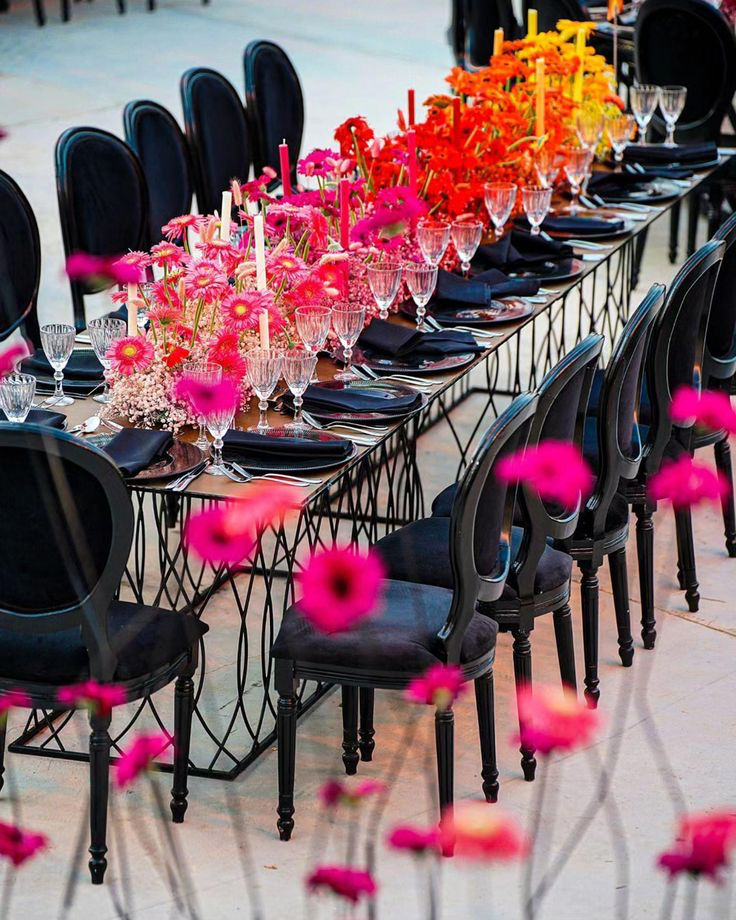
It’s not only adornments and texture that determine the look and feel of a space. Should you want to create a romantic, whimsical atmosphere for your wedding, for instance, a pastel palette will definitely capture that. Alternatively, vibrant secondary colors such as orange and purple can capture a lively, celebratory tone. Balance is everything though. Dominant colors like magenta and Barbie pink are a sure-fire way to make a bold statement, but offsetting them with some neutrals can help to achieve a visual harmony without overwhelming guests. A classic example of this would be the energizing yet calming combo of neutral linen with pops of red. That being said, there are absolutely no set rules.

Intentional color palettes have the power to truly enhance an atmosphere as well as bring a theme to life, which is why it’s important to consider the emotions you or your client wish to evoke. A navy blue and gold pairing for a corporate conference, for instance, captures professionalism and class, while soft greens and bluish pinks for an outdoor wedding enhances serenity. Mauves, teals, and blushes also work brilliantly for a bohemian birthday party.
From invitations and flower arrangements to table settings and cake decor, we’re seeing a lot of punchy, bold colors gracing venues nationwide. It’s giving major joie de vivre and we’re here for it. But if you’re leaning toward an ethereal, garden party aesthetic, we encourage the commitment.

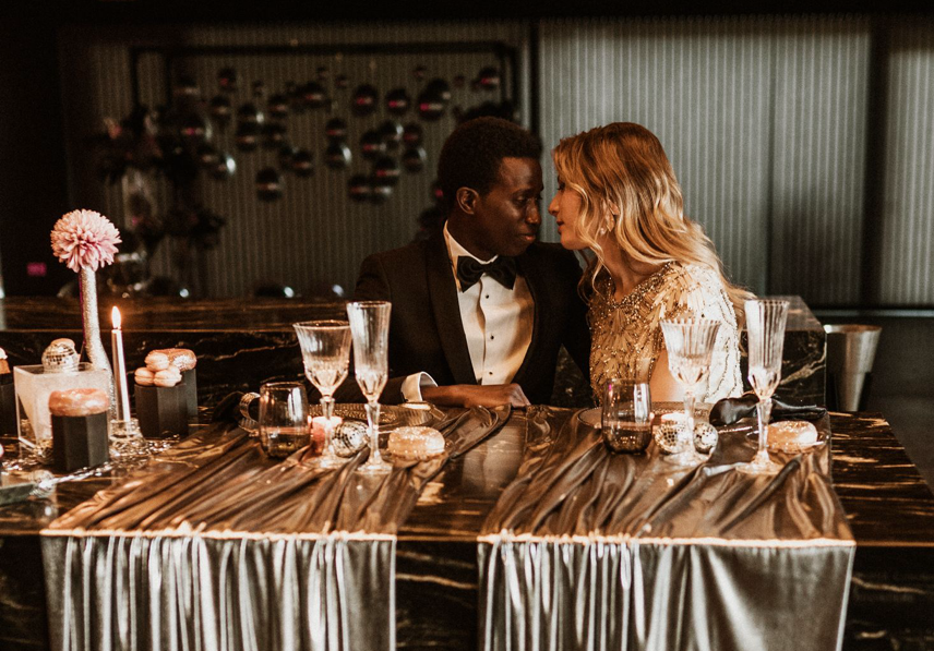
Quiet luxury is for the ages. So is wisteria and hydrangea.You can stay true to yourself and your classic aesthetic while also adding fun embellishments like metallic pieces and colored linen accents. There are endless ways to make a palette cohesive, endless pairings that are yet to be discovered. The most important thing is that you’re intentional and thoughtful.

IWED | The Institute of Wedding & Event Design
-
98 SE 7th St. Deerfield Beach, FL 33441
-
1-800-504-7615
