Beyond Red and Green
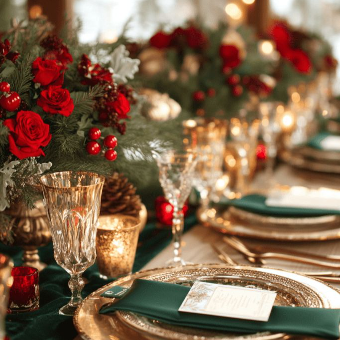
Christmas may be the coziest time of the year, but that doesn’t mean it has to be the most conventional. There are so many ways to capture the festive spirit. Color palette is one of them. Deck the halls with boughs of holly, sure, but decking them with red and green isn’t necessary for capturing the mood. Why not let this be the year you try something new? You can keep the egg nog and the gingerbread. Just swap out the primary colors for something fresh and unexpected!
Before committing to any specific palette, there are some guidelines that can help get you there. Do you prefer warm or cool tones, for instance? Do you gravitate toward matte finishes or metallic embellishments? There are no wrong answers! It’s easy to get overwhelmed by the selection, but if you start with a simple foundation, building a striking and unconventional palette is much more effortless. This applies to a kaleidoscopic palette as much as it does to one that is monochromatic.
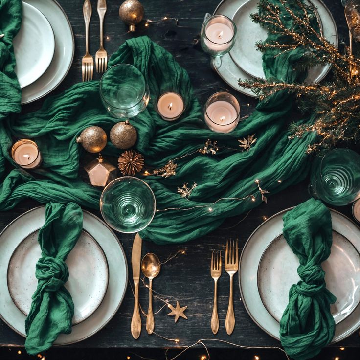
If you’re a traditionalist at heart, you don’t have to stray too far. Opt for a monochromatic palette of blues for a cooler set up. It’ll feel like being ensconced in your grandma’s china cabinet. Alternatively, opt for a classic green and gold pairing to keep the vibes warm and subtly glamorous. Think green garlands or green packaging covered in gold tinsel or festooned with gold ribbons. It’s a perfect fusion of natural and extravagant. Another more traditional palette we love that isn’t too heavy on the primary colors is white with varying pastel accents. This is the interior decorator’s equivalent of the clean girl aesthetic.

On the other end of this style spectrum are those who are more kitsch or avant garde or bohemian. If this is you, you’re probably more interested in bold and punchy palettes or ones that are unusual. Ivory and silver just won’t cut it! There’s something pleasing about the everything-but-the-kitchen-sink approach, after all. You just have to be careful. Bright baubles and throw blankets and candles capture so much whimsy and cheer, but all of it at the same time can also be overstimulating. Vibrant is good. Dizzying is not. So if you’re leaning toward vibrant, magentas and oranges and teals make for a lovely combination whether opaque or translucent. You can even include some geometric textiles if you want to take your decor up a notch.

Now, if you’re feeling really daring this holiday season, you can incorporate animal prints. Leopard and cheetah are especially popular options, but do not do this unless you absolutely love it. They pair so well with so much, though. Practically any shade of red or pink goes. We love how eye-catching it looks with saturated pops of color, but pastels work just as well. Drizzle some tinsel over it all and it’ll feel oh so festive!
There’s a whole big world beyond red and green, and all the colors of the universe are there. Which ones are calling you?

IWED | The Institute of Wedding & Event Design
-
98 SE 7th St. Deerfield Beach, FL 33441
-
1-800-504-7615
